Web Interface
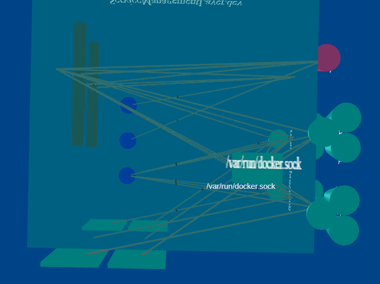
The web interface provided by the ailtire framework allows for artitects to extend the web interface through a model view controller pattern. It provides both server generated pages and single page ajax style web pages. By default the web interface helps the architect simulate the architecture and visualize complex relationships and interactions between the different subsystems, models, and actions. It presents all UML views of the model in a dynamic model. Including visualization of object instances, events, scenario and use case execution.
Library dependencies
Ailtire leverages some javascript libraries to aid in the rapid development of a web interface. The following are the javascript libraries utilized.
- 3d-force-graph - used to visualize in 3D the static and dynamic architectural elements of the system.
- WebUI - This gives some help functions for laying out the web interface.
- JQuery - Underlying web library used by WebUI, ajax communication, and DOM manipulation.
- Three - 3D object library used to create 3d model elements.
Web User Interface Layout
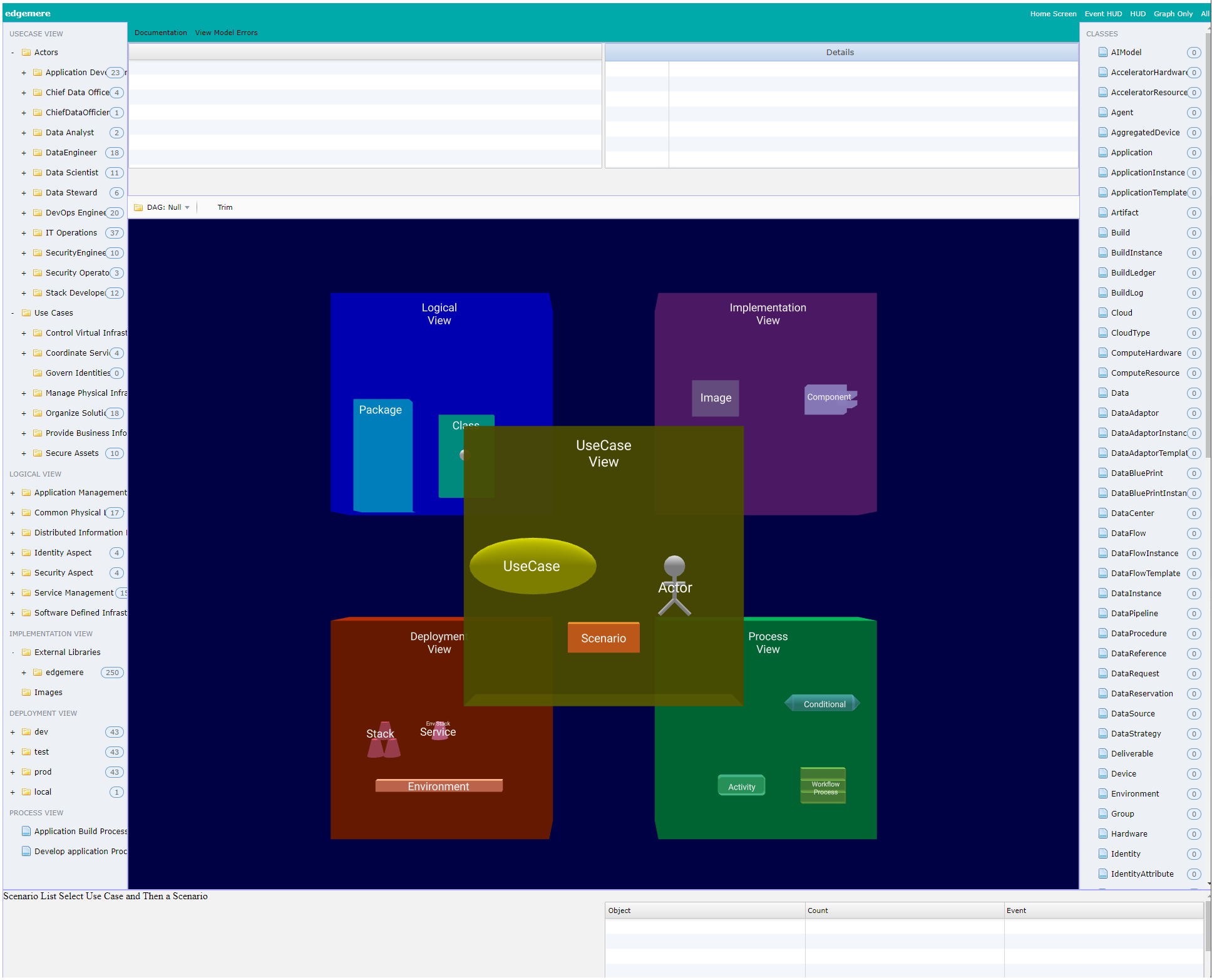
The default web interface for an ailtire application look very much like a typical IDE. We tried to follow a paradigm that would be familiar to most architects.
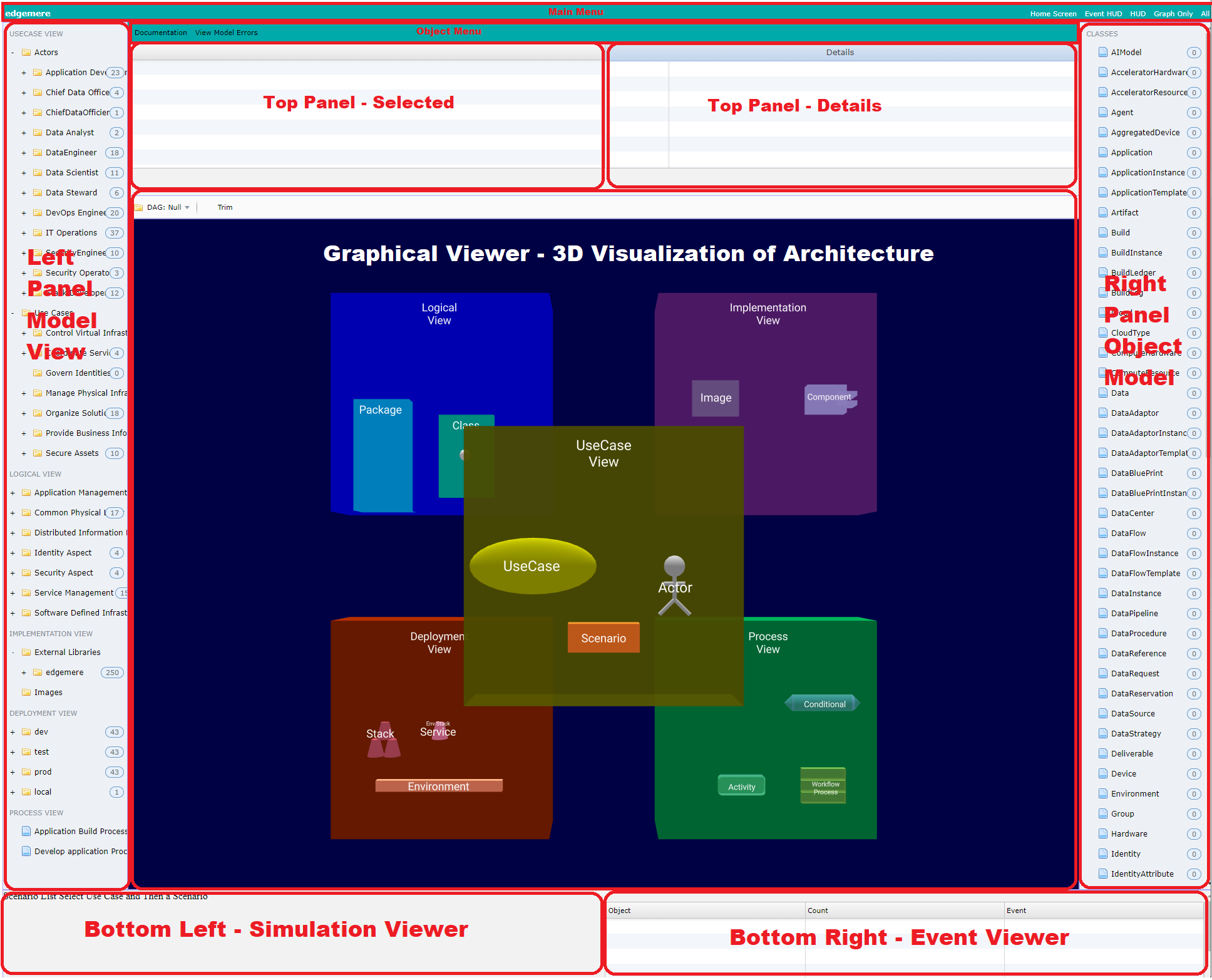
- Left Panel - Contains the Logical architecture (Packages and Models) and Use Case View(Use Cases and Actors) of the system. When an item is selected a 3D graphical representation shows up in the Graphical Viewer.
- Top Panel - Contains detail text of the selected item in any of the other panels.
- Right Panel - Containers the data model. When selected object instances are shown in the Graphical Viewer.
- Graphical Viewer - Shows a 3D view of the currently selected architectural element.
- Bottom Left - Shows a scenario simulator. Ability to launch and manage scenario runs.
- Bottom Right - Shows the events that have fired since the web page has loaded.
Each Architectural Element can be visualized in the Graphical Viewer. Just by selecting on the item the Graphical Viewer shows a 3D representation of the element. The elements currently supported are:
- Use Case View
- Actor
- Scenario
- Use Case
- Logical View
- Model Class
- Package
- Implementation View
- Library
- Container Image
- Deployment View
- Container Image
- Micro-service
- Networks
- Service Stack
- Process View
- Activities
- Business Processes
Model Class
Model classes can be found under the containing package. Click on classs definition and a 3D representation of the class will appear.
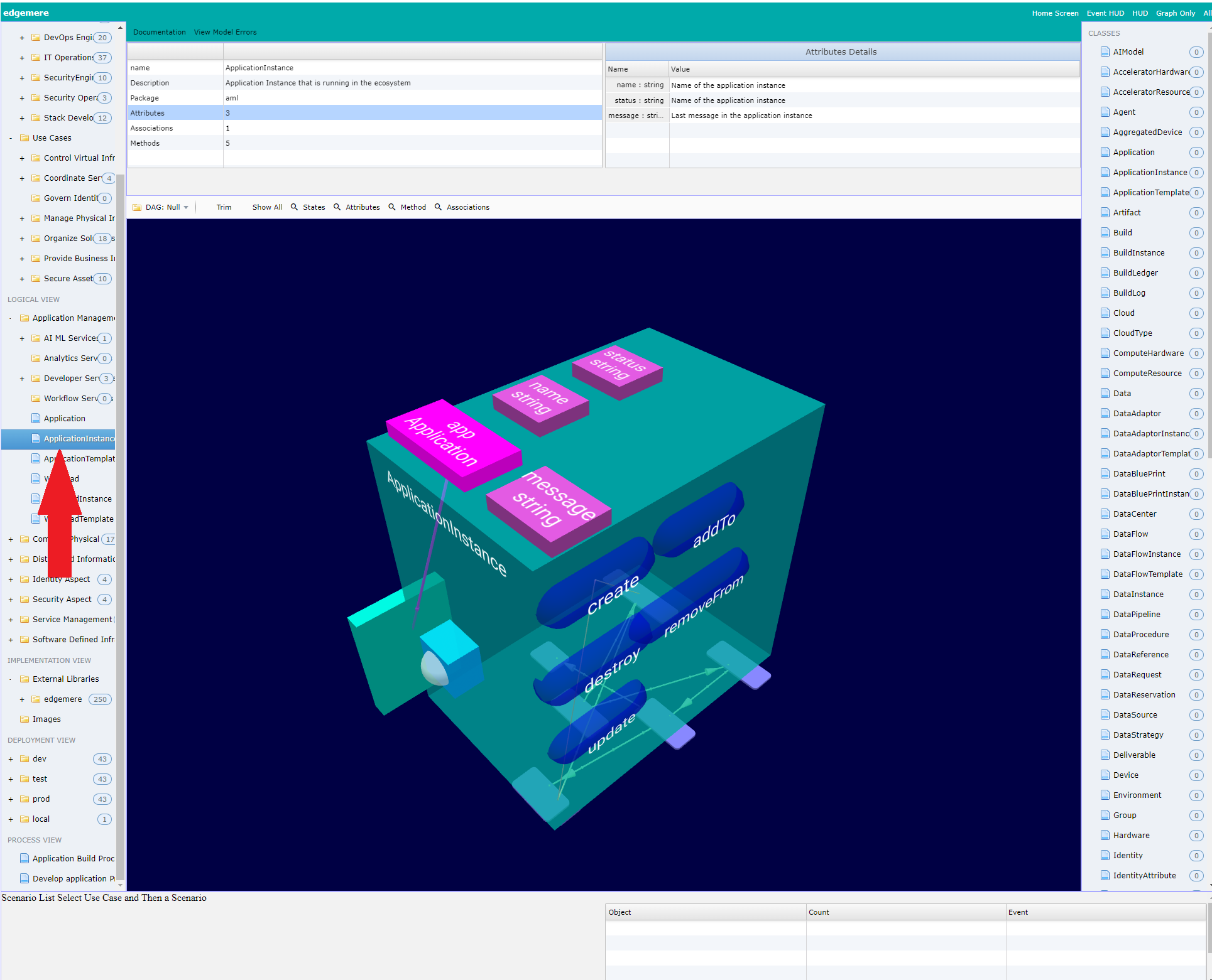
The class is represented by a cube. Each side of the cube represents a different aspect of the class.
- Top - contains all of the attributes and associations of the class,
- Right - represents the methods defined for the class.
- Bottom - represents the state net of the class
- Left - shows the classes that are part of the associations of the class.
- Front - shows the 3D graphical representation of the class.
- Back - Is currently not used.
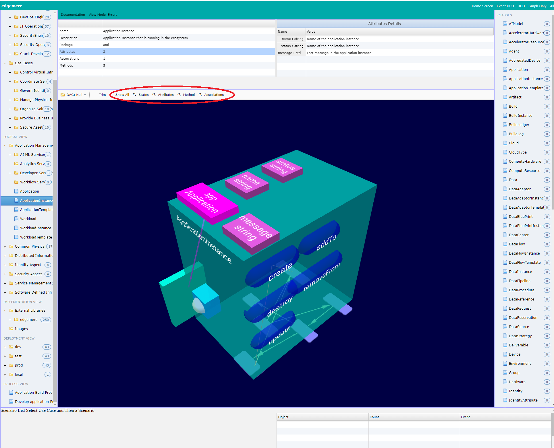
The graphical menu provides buttons to quickly view each of the sides of the class cube.
When the class is selected in the left panel the “Top panel - Selected” is populated with details about the class. Selecting any one of the items on the left will populate the “Top Panel - Detail” on the left. In this example the Attributes are selected on the left and the “Top Panel - Detail” contains details about each attribute. 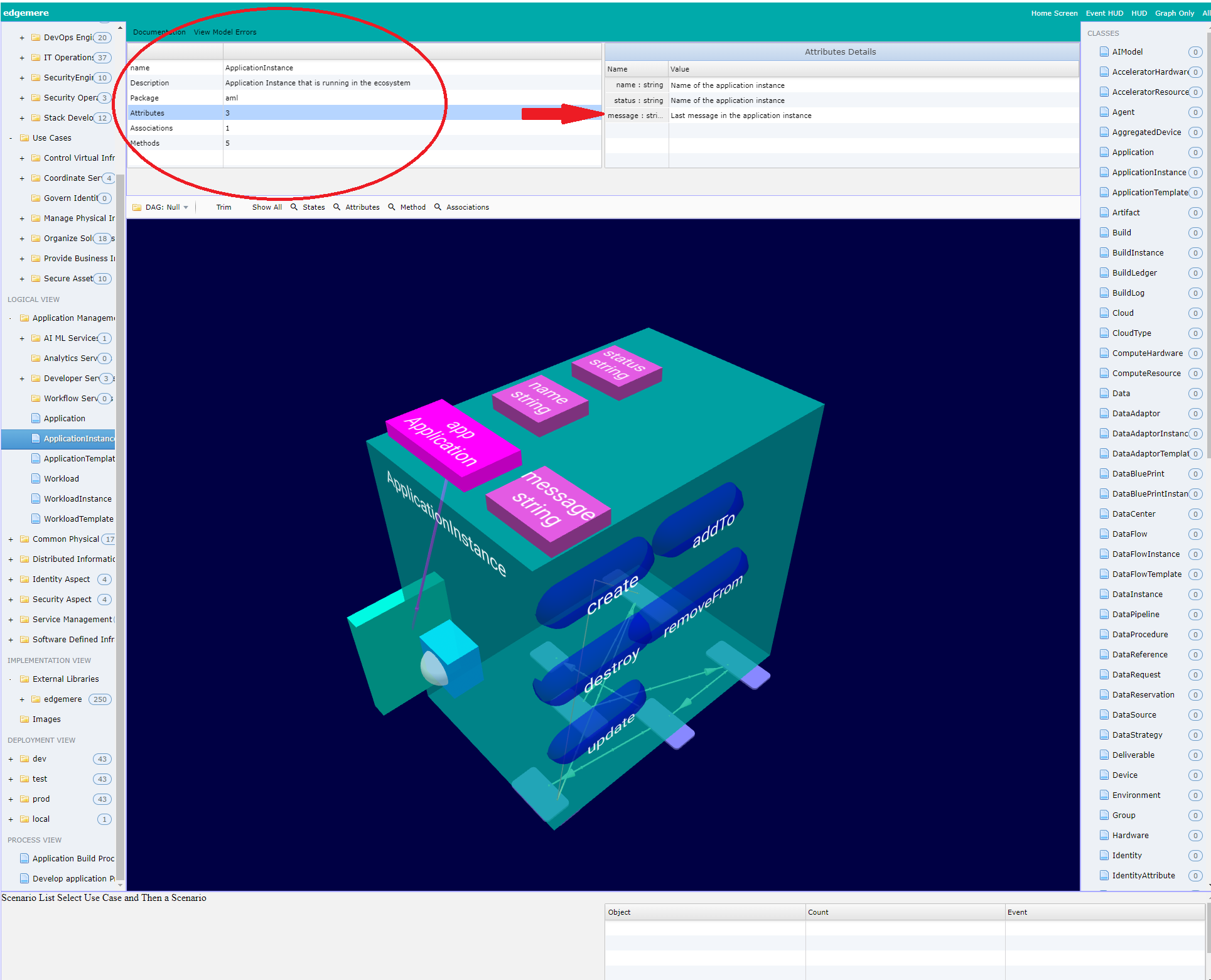
Package
To view the structure of a package select the package from the Left Panel. The Graphical Viewer and the Top Panels will automatically be populated with details about the package.
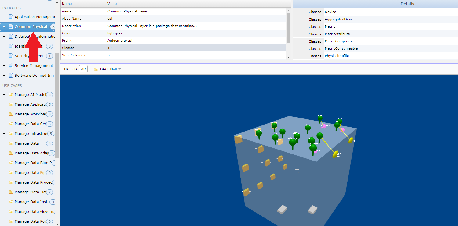
Notice that the Top Panel is populated with details from the package design. Additionally the Graphical view contains a depiction of the package in 3D. Details of the 3D view are below.
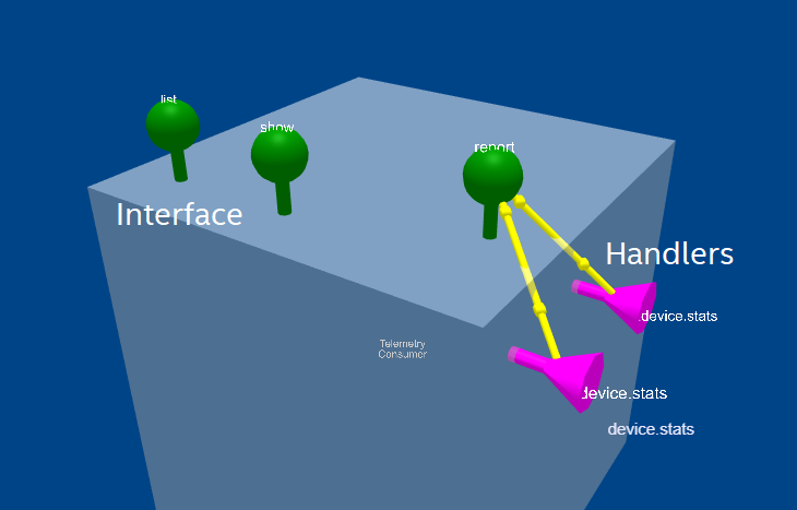
The interface to the package is in green and look like a lollipop. The Handlers to the Package are represented in Magenta with a funnel shape.
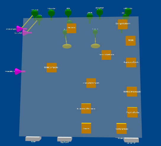
The Model Classes of a package are orange cubes and can be found on an adjacent side of the package cube.
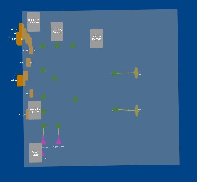
The Sub Packages are cubes that are the same color as the package and are the bottom of the Package Cube. Turn the cube over to see the sub packages.

The Use Cases are a yellow eplisoid on the front of the Package Cube. They typically will interace with one of the actions on the top of the package cube.
This view of the package gives the ability to see the package’s different views and how they interact with each other.
Actor View
The Use Case View has three major elements: Actor, Use Case and Scenario. To select the actor and view its details and a graphical representation of of the actor select the actor in the left panel. When you do this the top panel details will be filled in with details about the actor.
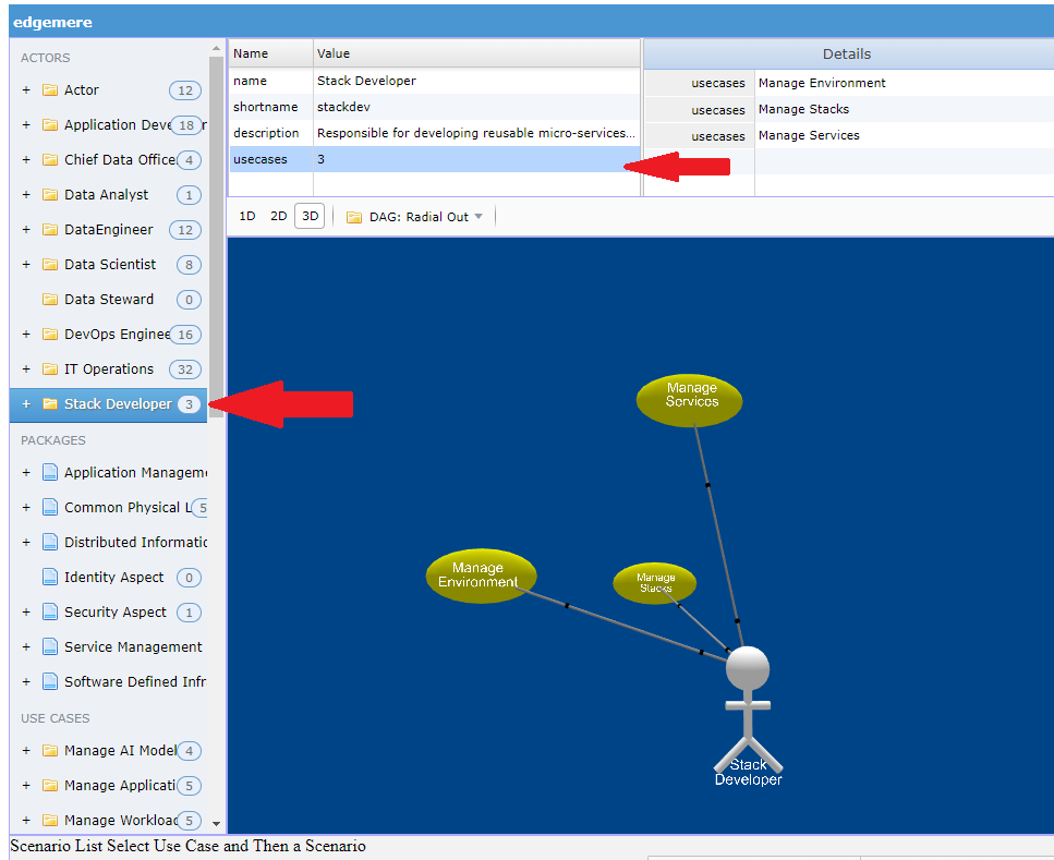
To drive down any further you can select on items in the detail view to get more information by selecting additional items. In this example usecases are selected and the detail of the usecases appear on the right.
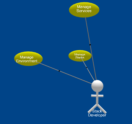
An actor is represented with a 3D version of the UML actor diagram. In this example the Actor has three use cases, represented by yellow episoids.
Use Case View
The Use Case is the primary artifact in the Use Case Model. To select details about a use case select the use case from the list in the left panel. Use Cases are at the bottom of the list.
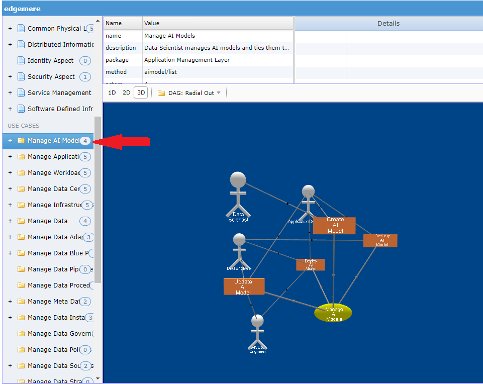
Notice that the Use Case details are found in the Top Panel. You can select different elements in the detail list to get more information.
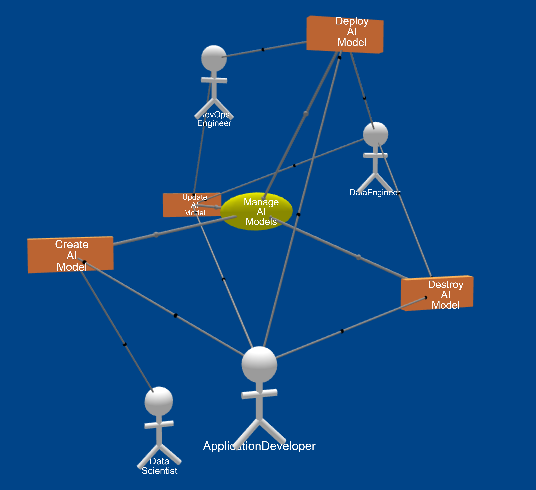
The Usecase is represented with a yellow elisoid and is conneted to Scenarios and Actors in the system architecture.
Scenario View
The Scenario shows how a use case is used by a specific actor. Scenarios have steps that are made of actions that make up how the system operates. When you select a scenario under the use case a couple of things happen. The graphical View shows the Scenario and its steps and the Bottom Left Panel is populated with the steps of the scenario.
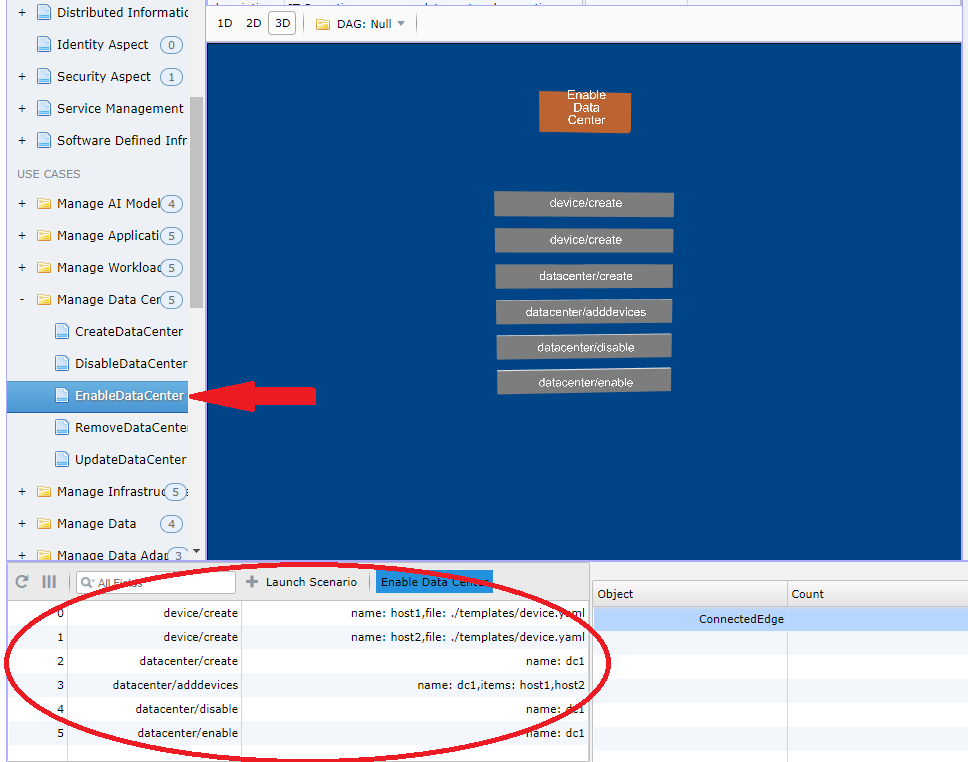
A Scenario is represented by by a rectangular orange cube and its steps are represented by a longer rectangular gray cube. The steps of the scenario are just below the scenario and are sequential order of execution.
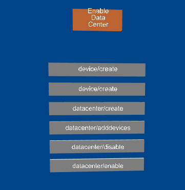
You can launch a simulation of a scenario from the Bottom Left Panel’s “Launch Button”. When the launch button is pressed each step is run sequentially. The commands represented in the steps are run on the command line in the base directory of the application.
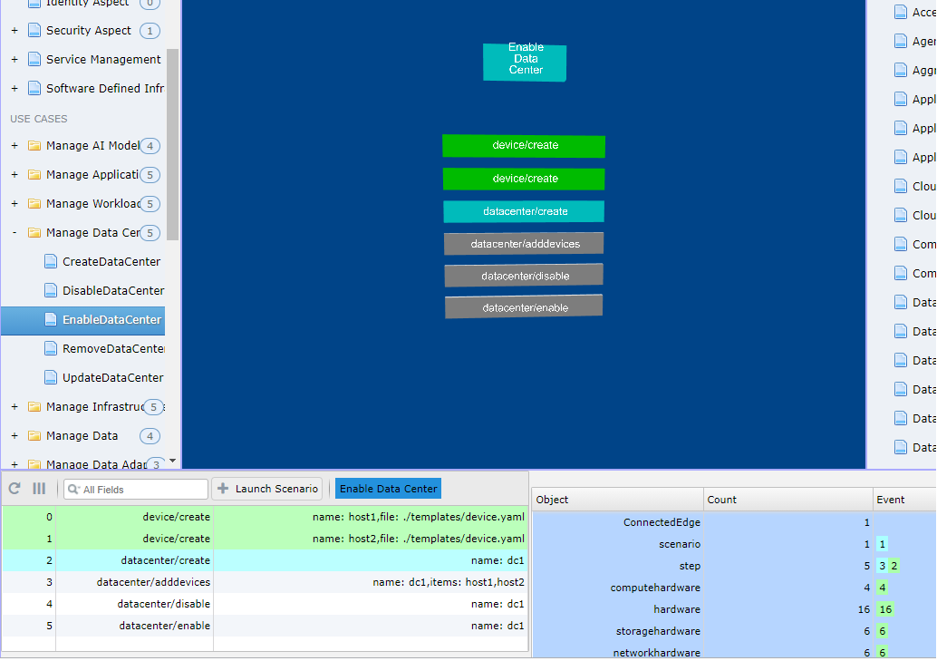
As the scenario is executed the steps change state. The state of the steps are shown with different colors.
- Blue - Running
- Green - Complete
- Red - Failed
- Gray - Not Run
The state of the steps are shown in the bottom right panel as well as in the graphical view.
Event View
The event panel is located on the Bottom Right Panel. This shows the number of firing of events in the system. The different events for a model are shown with colors. Currently the panel is read only.
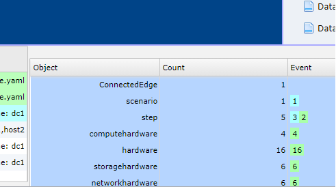
This panel can be used to watch events happen during simuations of scenarios and the step run during the simulation.
Object Instance View
Objects are created when scenario simulations are launched. The objects are grouped in the Model Classes. All of the Model Classes are shown on the Right Panel in the user interface. When you select an Object Model Class, all of the object instances of that Model Class are loaded into the Graphical Viewer. Only the first level associations are loaded into the graphical view.
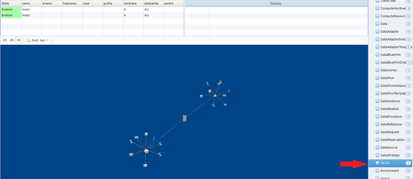
Each Model Class has its own 3D and 2D visualization. If they are not defined then a sphere is used to represent the instance. Associations are shown as links in the diagram. See Model Page for information about view definition.
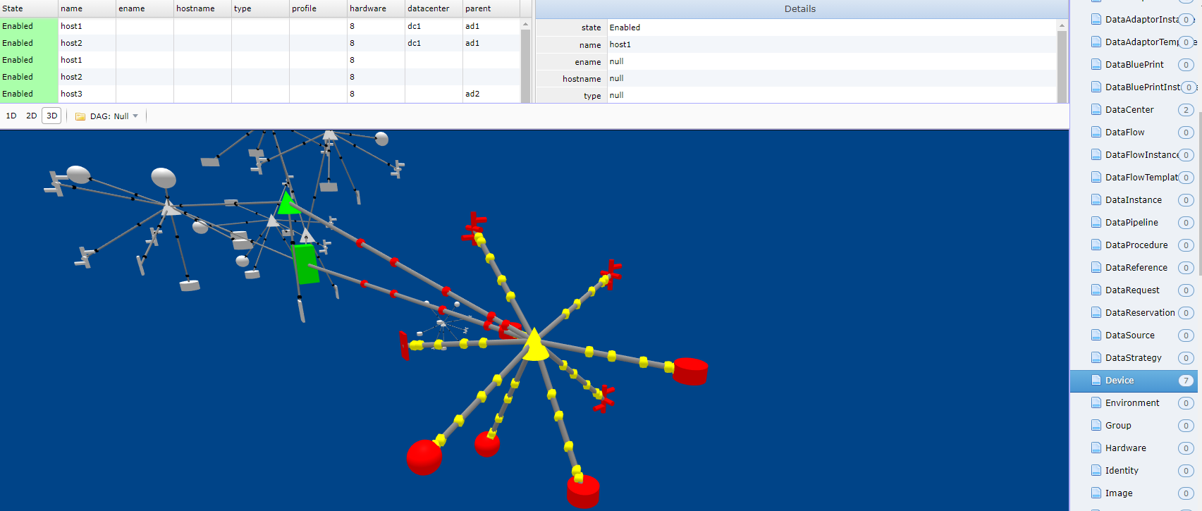
When the Model Class is select the Top Left Panel contains a list of object instances. To find out more details about each object instance select the item in the list. Details about the object instance will appear in the Top Right Panel. And the Graphical Viewer will highlight the Instance in Yellow and its relationships in Green (Parent Relationships) and Red (Children Relationships). It will also zoom to where the object instance is located in the 3D scene.
Scenario Simulation View
Simulating Scenarios is easily accomplished by selecting the Scenario in the Left Panel. When the scenario is selected the Bottom Left panel is populated with steps for the scenario. A launch botton appears and the architect can launch the simulation.

The steps have state and color represent the states. The states are shown in the graphical and panel views.
- Blue - Running
- Green - Complete
- Red - Failed
- Gray - Not Run
StateNet
TBD
Deployment Model
The application and all of its subsystems, and packages have a deployment strategy. The deployment plan can be viewed by selecting an environment under the deployment section in the left hand panel.
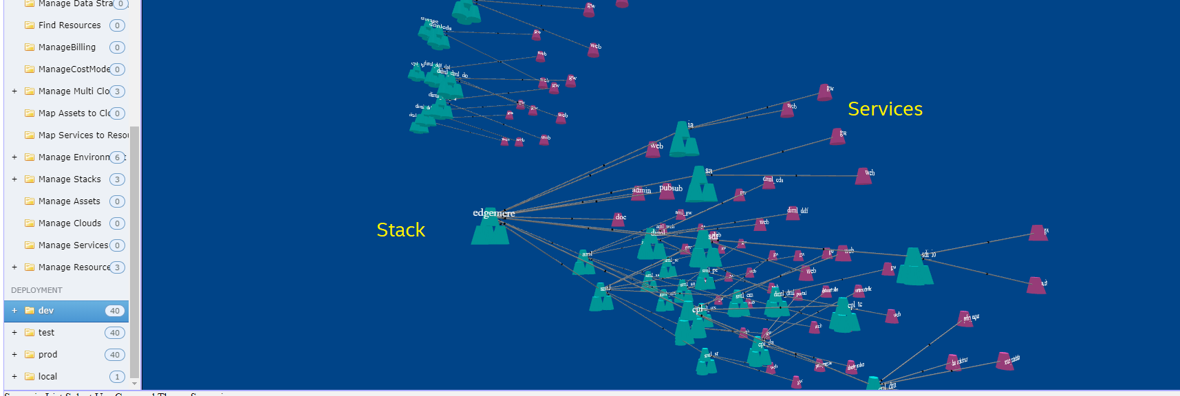
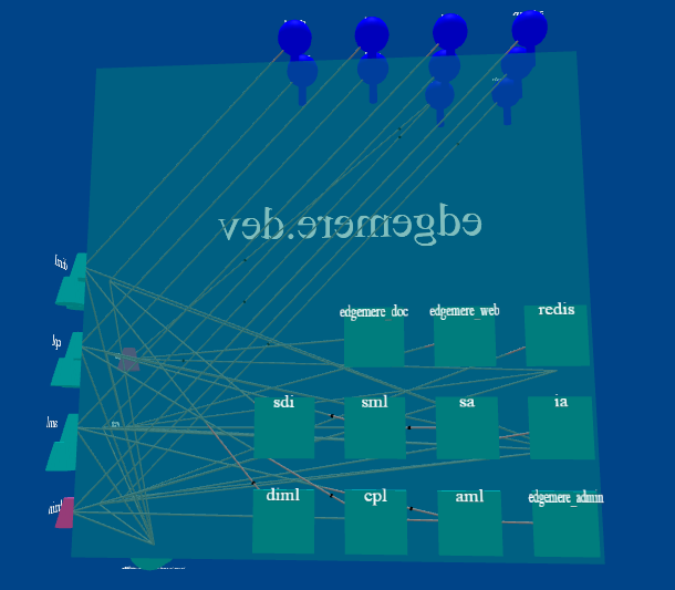
The key elements in and environment for deployment is the stacks and services deployed in the environment. A Service is represented as a truncated cone as shown in the diagram above. (Purple). A stack is made of a collection of services and is represented by a stack of truncated cones. Selecting the environment name will show all of the stacks and services that can be deployed in that enviornment.
Stack Definition
Stacks are made up of services, data, interfaces, images, and networks. To view a stack definition you can select the stack name in the left panel. The graphical viewer will show a 3D representation of the stack. The stack is represented as a cube with each side presenting a different aspect of the stack.
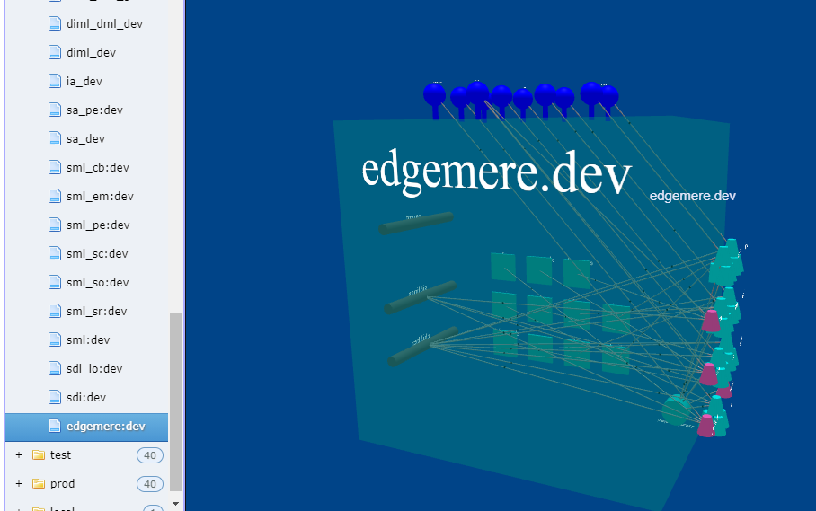
- Right - service and sub-stacks.
- Left - Networks
- Top - Interface
- Back - Container images used
- Bottom - Data and Volumes used
Interfaces
The interface to the stack contains information on how to access the stack through a common URL. Each service in the stack is mapped to a URL path. The base URL of the stack is determined at run time and can be determined by the controlling application or stack. This allows for lacing of services that can easily be accessed across multiple layers of complex systems.
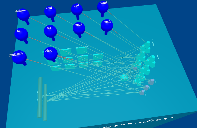
In this example, the base url is http://localhost:3000. The following URL paths would be valid.
- http://localhost:3000/admin
- http://localhost:3000/aml
- http://localhost:3000/cpl
- http://localhost:3000/diml
- http://localhost:3000/ia …
Stacks and Services
Every stack is made up of a set of sub-stacks and/or services. These services are the work horse of the stack, and are implemented using containers and micro-services. These services are mapped to at least one network and can have data volumes and interfaces mapped to them as well. Each service has a corresponding image that defines what is run in the service.
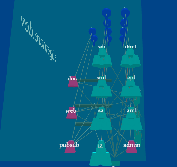
Clicking on the service will highlight the other items it is linked to in the stack definition.
Image
An image defines what is run in a service when it is executed. These are implemented with standard container images. They are shown on the back of the stack definition cube.
Network
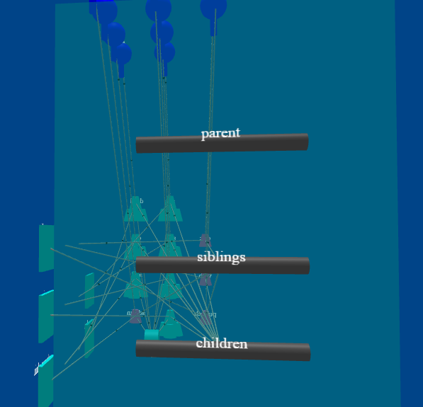
Every Stack has at least one network. Most have by default two networks Parent and Siblings. Ailtire is very opinionated on the network and micro-segmentation based on each stack. If a stack contains sub-stacks it will also create a children network and connect all sub-stacks onto the children network. This gives separation between the different service layers in the architurce. The networks are on the left side of the stack definition cube.
Data Volume
Stacks not only contain services and networks, they also contain data volumes. This gives the ability to connect data sources to the running stacks. Data volumes are shown on tbe bottom of the stack definition cube.
